By Lydia, Creative Director
¡Hola! I'm Lydia, the Creative Director here at Creative Bytes. I spend my days making sure every color, font and word a business puts out actually sounds and looks like them. Today I want to clear up one of the most common mix-ups I see.
Okay, real talk. A lot of business owners tell me, "Oh, we already have a brand. We got a logo made a few years ago." And I love that you invested in a logo! But if that logo is the only thing holding your business together visually, there's so much more of you waiting to shine through.
The quick answer: Your logo is a symbol. Your brand is the whole feeling people get when they deal with you: your colors, your fonts, your voice, your photos, how your emails read and how your website feels. When those pieces don't match, customers notice, even if they can't say why.
Here's what the numbers say
- Organizations expect around a 33% revenue lift from presenting their brand consistently. (Lucidpress, 2019)
- 80% of marketers now use AI to create content, and most of it lands as "mostly average." A distinct brand point of view is what stands out. (HubSpot State of Marketing, 2026)
- Searches for clean, simple branding are up 54%. (Canva 2026 report via CMO Tech)
¿Y sabes qué? In a world full of look-alike content, a clear, consistent brand is how people recognize you and remember you.
So what's the difference, really?
Think of your logo like your signature. It matters, ¡claro que sí! (absolutely!) But nobody falls in love with a signature. They fall in love with how you show up: the way you talk to them, the way your storefront or website feels, the care in every little detail.
Signs your logo is doing all the heavy lifting
- Your colors change depending on who made the flyer. Blue on the website, teal on Instagram, something else on the business card.
- You use whatever font is handy. Every document looks a little different.
- Your social posts don't sound like you. One day formal, the next day all emojis.
- You can't describe your brand in one sentence. If you can't, your customers probably can't either.
- Your logo looks fuzzy or stretched in places. That's a sign there's no set of ready-to-use brand files.
Try this today (it takes 5 minutes): Pull up your website, your Instagram, your business card and your last email to a customer. Line them up side by side. Do they look like they came from the same business? Circle anything that feels "off." That list is your starting point. Poco a poco (little by little), you'll close the gap.
Quick questions we hear a lot
Do I need a new logo to have a strong brand? Not always! Sometimes your logo is great and what's missing is the system around it: colors, fonts and a clear voice.
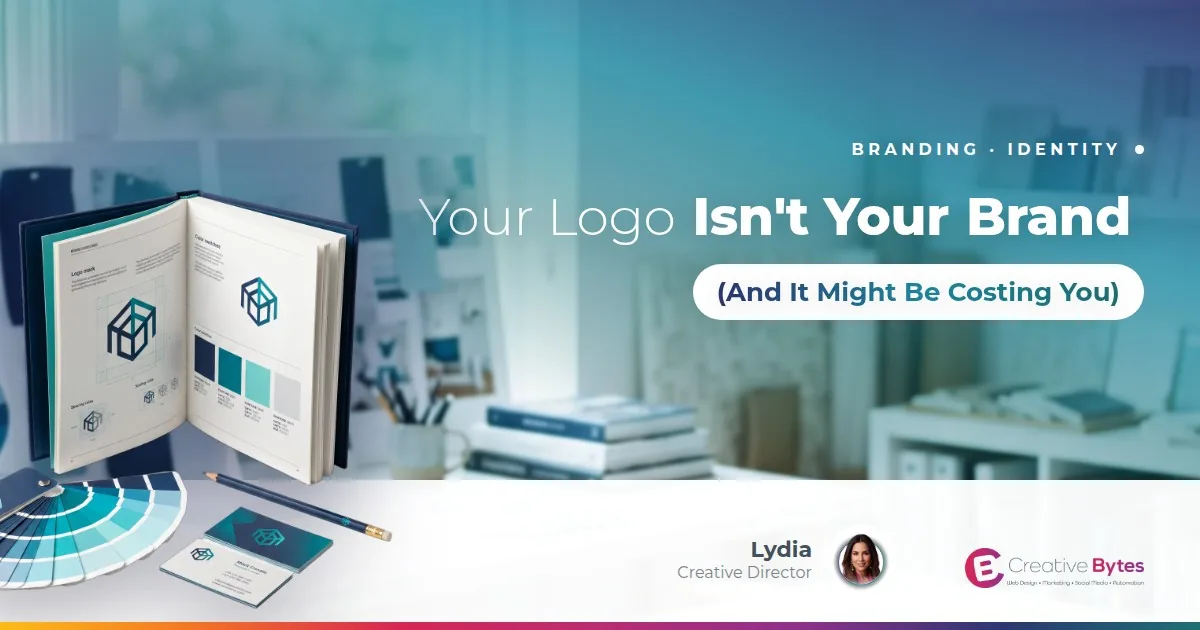
What's a brand guide? It's a simple reference that shows how to use your logo, colors, fonts and voice, so everything you put out looks and sounds like you.
Want more brand tips like this? Join the Creative Bytes newsletter and every new post will land right in your inbox.
Curious what your logo could grow into? We'd love to help you explore it. Take our 3-minute quiz for a free, easy way to see where you stand, or browse our branding services. Your business deserves a brand that shows who you really are. And if you'd rather just talk it through, you're always welcome to book a complimentary consultation. We've got you. ¡Bendiciones!